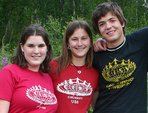
At first glance all three CISV logos in this picture look identical. But if you take a closer look you can see marginal differences, and in fact, I think this picture shows the three last official version of the CISV logo before the rebranding took place in 2006.

Before diving into the history, I would like to showcase the logo of the United Nations. I think it goes without question, that this has been the original inspiration for the CISV logo. In the fiftees the United Nations had just been founded and probably caried the same hope for a peaceful globe that lead to the creation of CISV. Some more obnoxious inviduals claim that the CISV-logo is the UN-logo - after someone sat on it.
This version is really old. I only found it once - on a CISV shirt that was probably printed in the sixtees. I'd love to know if this was the original first version of the CISV logo.
Again, I'm not sure, from when this version is, but it just looks like s slight modification from the previous version.
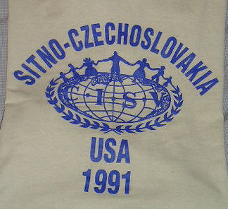
We're lucky with this one, as it has the year printed on it - but it's surely not the official logo at the time. However it has some resemblance of today's logo.
This is a logo from 1979. It includes the famous dots in the continents.
The good thing about this version is, that the shirt tells us exactly when it was printed. I do think that it is still the same logo as 1979, just that the print quality makes the letters C and V almost disappear. However, I'm fairly sure, that when I joined CISV in 1989 this logo had already been modified (without the dots!), so as usual, it takes a few years until a new designs penetrates to all CISV designers around the globe.
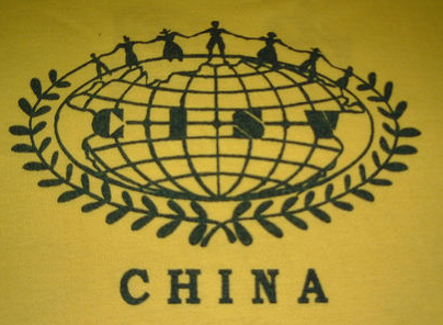
This logo is a big what-the-hell? It has a bit of a sixties/seventies-look, but I'm quite doubtful that China participated in CISV during Mao's cultural revolution. So it's more probably not so old but designed in a retro-look.
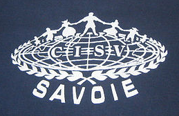
This is just an example of many hand-drawn variations of the CISV logo - this one, I particularly like, because with the thick and thin lines it looks very elegant.
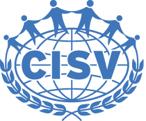
This is the official updated version of CISV logo, with a more precise and sharper "look and feel". It must have been created in the late 1980s. When you stare at it for a while you do wonder - why does the I hate the S? The space between those two letters just seems to be a bit to wide. Another interesting asspect is that the laurel branches are asymmetrical.
In 2001 Doris Allen turned 100 years old and CISV 50 - so here is the anniversary logo. It includes the official logo, with the small variation, that the continents are solid.


These are several options that were presented to CISVers around the world in 2005 as a new visual identity. Of course people around the CISV world complained. I even remember receiving an e-mail from a participant from the very first camp, saying that the logo should not be modified at all. Well...obviously it was, and not for the first time...but not as much as proposed here.
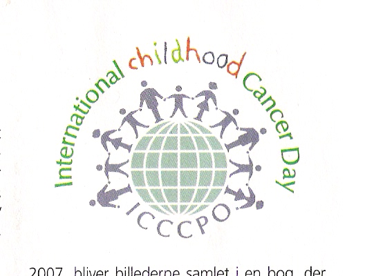
Obviously, we're not the only ones who deal with children around the globe. This logo looks familiar, doesn't it?
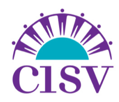
Finally, this is today's CISV logo, which was presented in 2006 as part of a rebranding process, that also brought us the "building global friendship" tagline. The rationale of updating the logo included to make it readable, even if the logo is printed very small. And you can see that the ratio between the letters CISV and the logo itself has shifted towards the lettering. Also, the traditional costumes were dropped, and the people on top of the CISV world all look the same. Looking at the history of the logo, this last modification was probably the most radical in the history of CISV. I know a lot of people hated it at the beginning, but as usual - people just get used to change.
Hey Nick--I came across this post while searching Google for images from the first Village for use in an intro to CISV video.
Somewhere in the CISV USA National Office are several t-shirts from the original village, with what I would assume to be the original logo on them. I came across them while helping sort through some stuff at the office last year, but didn't take a picture.
If you feel like waiting until October, I can likely track down a picture then...otherwise, try e-mailing our national office.