CISV has quietely introduced a new look-and-feel.
In 2005 a proposal was made to brush up the "corporate identity" of CISV, to create a real brand, that would take a stronger position within the vast market of volunteer organisations. Also to create a more up-to-date version of the CISV logo and a tagline. Today we are most familiar with all this, but what seems normal today is the result of a tense fight between "reformers" and more conservative (better: less-market-oriented minds) in our organization.
 Besides the question of having a brand for CISV or not, it's also about, how much does this brand penetrate through all levels of our organization: How well and how strict this brand is applied to our documents, merchandizing and websites. Quite an effort was made to give detailed instructions on how "CISV looks". (Check out the branding guidelines website for details.)
The "CISV brand" does have a few caveats: The recommended fonts are not free, which makes them expensive to use, if every indiviudal has to pay them. Also, many CISVers oppose a "uniformal" look of CISV, and would rather opt for a "soft brand". Finally, the colors suggested don't offer many nice combinations - something I struggled with when chosing the tones for the AIM 2010 logo.
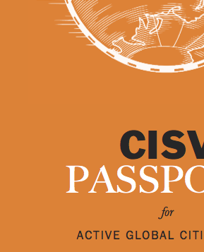
Just recently Mosquito tactics and also the CISV Passport have been published in a new "look and feel": New fonts, new images, new pictures, etc etc. Personally, I love the "new style", because it seems professional and up-to-date. Now, while Mosquito tactics is a side-project, the CISV Passport is a core document. Creating it with a new design does give the impression, the branding guidelines of 2006 aren't a priority any longer. It even feels like, some people who didn't like the official "look and feel" just came up with something else.
I do think CISV's brand should be constantly reviewed and updated, and I'm not sure any committee is in charge of this ongoing process. Somebody should be, because it's part of being professional in what we do as an international NGO that wants to be taken seriously.
In 2005 a proposal was made to brush up the "corporate identity" of CISV, to create a real brand, that would take a stronger position within the vast market of volunteer organisations. Also to create a more up-to-date version of the CISV logo and a tagline. Today we are most familiar with all this, but what seems normal today is the result of a tense fight between "reformers" and more conservative (better: less-market-oriented minds) in our organization.
Besides the question of having a brand for CISV or not, it's also about, how much does this brand penetrate through all levels of our organization: How well and how strict this brand is applied to our documents, merchandizing and websites. Quite an effort was made to give detailed instructions on how "CISV looks". (Check out the branding guidelines website for details.) The "CISV brand" does have a few caveats: The recommended fonts are not free, which makes them expensive to use, if every indiviudal has to pay them. Also, many CISVers oppose a "uniformal" look of CISV, and would rather opt for a "soft brand". Finally, the colors suggested don't offer many nice combinations - something I struggled with when chosing the tones for the AIM 2010 logo.
Just recently Mosquito tactics and also the CISV Passport have been published in a new "look and feel": New fonts, new images, new pictures, etc etc. Personally, I love the "new style", because it seems professional and up-to-date. Now, while Mosquito tactics is a side-project, the CISV Passport is a core document. Creating it with a new design does give the impression, the branding guidelines of 2006 aren't a priority any longer. It even feels like, some people who didn't like the official "look and feel" just came up with something else.
I do think CISV's brand should be constantly reviewed and updated, and I'm not sure any committee is in charge of this ongoing process. Somebody should be, because it's part of being professional in what we do as an international NGO that wants to be taken seriously.
I slightly disagree Nick. Franklin Gothic (the main CISV font) comes free with MS Word. Interstate can be found easily on the internet or asking a CISV person to help :-P.
I didn't have to work too hard as NJR to create documents and forms that fell within the branding guidelines. Are we just lazy?
A person who knows something about fonts would never use Franklin and Interstate as matching/contrasting fonts. Even more so when we know that the brand guidelines needs to be very easy to use, since they should be used by hundreds of CISVers (non-graphic-designers) around the world.
There has been a discussion lately within the IJB Committee about this particularly topic.
Some people firmly opposed to the use of stated fonts and colurs (which were described as dead ugly which did not reflect liveliness and youthful identity of CISV). It was argued they limited us on our creativity and shouldn't use just becuase they were visual "guidelines".
On the other hand another group of people, which I include myself here, strongly believe this guidelines work to create unity in the way we show ourselves inside and outside our organization, they communicate our values and spirit. Plus, along the text, the word "suggest" is repeated several times (although it's a strong suggestion).
I believe people have very strong feelings on this issue but we don't have to forget that it was a long process which implied a lot of resources and dedication from the Board which took this on their hands and worked in tight cooperation with our organization to come up with the best results possible.
And besides that, I don't think our fonts and colors are "dead ugly".
I had just posted a comment on another post about brand guidelines and I find this!
I think everyone tries to add a personal touch to whatever one's doing, and the brand guidelines seem to cut a little bit of people's creativity (in people's opinion) and that can be a reason why they are not being as respected as they were meant to be.
I must confess I'm not a very big fan of the re-branding that happened, the tagline or the brand guidelines and I agree that the new look is a lot better.. But the main problem here is UNITY and that's just what is not happening that well!
CISVers would be better off if they directed their creativity towards developing peace education than choosing fonts and colors. Im all pro strong guidelines, but they need to be possible to follow (without buying fonts).
well people feel "cut in their creativity"....is not neccesarily a bad thing. ok the feelings, but seriously i am happy that a lot of relly ugly (due to untalented designers) documents and tshirts started disappearing when the brand came up.
i very much agree that there should be a committee,or something similar, to be in charge of updating the brand, or in 20 or maybe less years we will be where we where before 2006.
The guidelines are just guidelines, you still can be crative without braking those suggestions. I actually beleve that people misunderstand the diference between suggestions and rules. We realy need the guides for those who can't came up with a balanced material, in harmony with cisv goals. But we also need some freedom to put our view on it, it depends of what you want to mean, like this ad we made here to instigate new leaders. We probaly broke all the guideline's suggestions, but it works as a non-oficial local piece, wich was our intent.
http://eeek.blog.com/files/2010/01/treinamento-convoca-2009-web.jpg
Oh yea, I also suport the idea of a design team updating our logo, but it has to be at least every 15 years.
peace
Somebody asked for an international marketing comittee ? I mean, we have finance, administration, public relations, development, each line of product (=camp), ...
So I guess the only part of a professional organization we lack is marketing, which could fulfill the branding issue as well as many other ones : for instance, early detecting of new (or changes of) products (=camps) demands and opportunities.
I'm sure we have skilled marketing people in CISV, why not use them ?
I just recently did a presentation on corporate identity so I checked quite a few companies' branding guidelines and I found that CISV's guidelines really only state the basics. That should mean that the designers are not at all "cut in their creativity" since they should be able to stay creative within certain boundaries too. I would however be happy to see a more detailed branding guideline for those who really just want to use a uniform schema for their things. I know it's possibly hard work, but there could actually be a website template for the chapters who don't have people that can design and manage a site, there could be more precise instructions on the print design like the positioning of the text the logo the pictures.
I know that this is not a huge enterprise or so and members of CISV are creative people wishing to contribute their own ideas (myself included) but the goal of a corporate identity is to have a good impression on the people that might not know anything about the organisation. If they see print material diverse in every country only similar in colours and logo (no they won't actually realise if the font is the same) it will have the impression that this is not a serious thing and there is no professional team working behind it. All the people see at first are the publications and the websites, so it is important to have the impression that it's a well organised thing otherwise parents might decide not to send their kids abroad to camps cos they will feel they can't trust them to us. Maybe this is far fetched but I know that I would have a negative impression if I checked out an organisation and found that the different subparts all use totally different visual materials.
I would totally love to work in marketing of CISV... should go study something in that field too maybe. :D