Just yesterday we finished developing the logo for AIM 2010 in Germany - Breaking Down Walls. But before I show you the new logo, let's revisit some logos from previous AIMs:
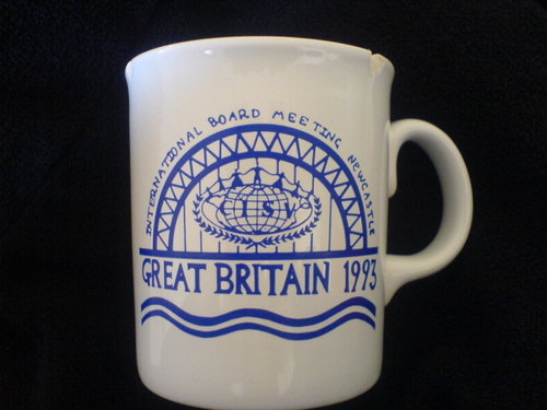
This mug I found at a friends appartment.
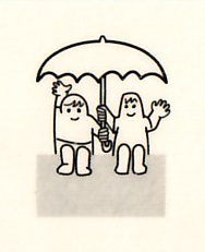
A very friendly logo for IBM 1994 in the Netherlands. Not sure why the umbrella?
IBMs 1995-1997, I couldn't find anything.
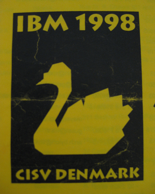
IBM in Denmark 1998 with a Swan - my first IBM.
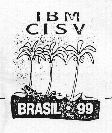
I remember the logo for the IBM 1999 in Brazil also existed in a color version. The palm trees remind me that the site was located at the beach - fantastic.
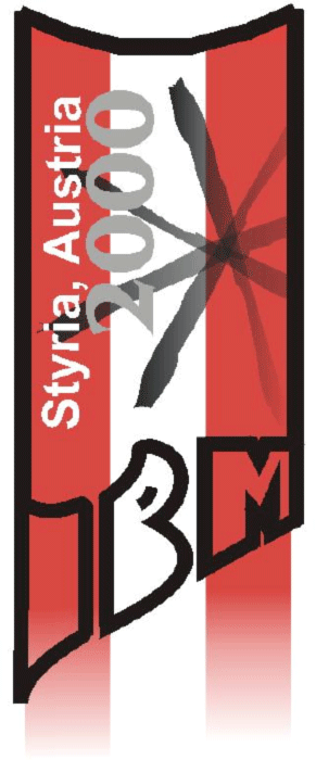
Austria 2000: Not my cup of tea.
USA 2001, the anniversary IBM, had a simple logo, but I can't exactly remember.
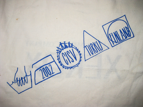
IBM Finland 2002 had washing instructions as part of their logo.
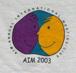
This shirt was originally printed with "IBM 2003" printed on it. When the name changed, Alvaro (CRC) auctioned off the last IBM shirts as collectors items.
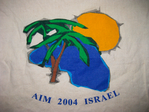
AIM 2004 in Israel - abstract palm tree, sun and lake.
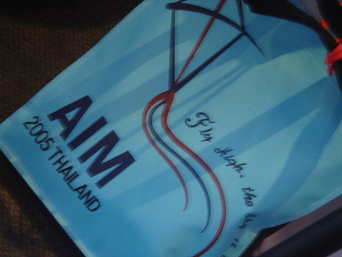
A kite was used as the logo for the AIM in Thailand 2005 - this AIM also had a mascot, a little frog, drawn by Jiro (THA).
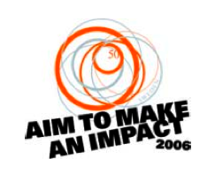
AIM 2006 in Sweden with a smart tagline. One of my favourites.
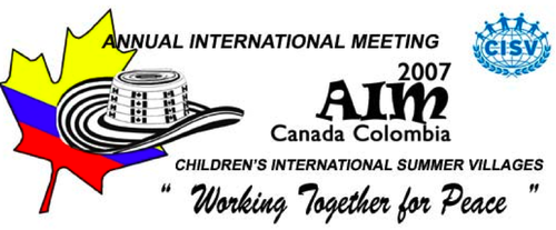
AIM 2007 in Colombia, cohosted by Canada , hence the logo with a maple leaf and hat.
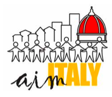
AIM 2008 took place in dowtown Florence, symbolized in the logo, including il duomo.
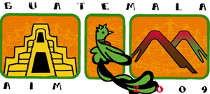
This year's AIM in Guatemala has a Mayan pyramid, a Quetzal and volcanos integrated.
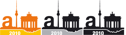
And here it is: The color, black and white and monochrome version of the AIM 2010 in Berlin next. year. I posted some more stuff on the development process over at my showcase blog Picknick Productions.
(I'm still missing logos from before 1993 and a few between 1995 and 2005 - if you happen to have one on a shirt, a cup, whatever, I'd be grateful, if you could send me a picture at ftb@absolutpicknick.de.)
This mug I found at a friends appartment.
A very friendly logo for IBM 1994 in the Netherlands. Not sure why the umbrella?
IBMs 1995-1997, I couldn't find anything.
IBM in Denmark 1998 with a Swan - my first IBM.
I remember the logo for the IBM 1999 in Brazil also existed in a color version. The palm trees remind me that the site was located at the beach - fantastic.
Austria 2000: Not my cup of tea.
USA 2001, the anniversary IBM, had a simple logo, but I can't exactly remember.
IBM Finland 2002 had washing instructions as part of their logo.
This shirt was originally printed with "IBM 2003" printed on it. When the name changed, Alvaro (CRC) auctioned off the last IBM shirts as collectors items.
AIM 2004 in Israel - abstract palm tree, sun and lake.
A kite was used as the logo for the AIM in Thailand 2005 - this AIM also had a mascot, a little frog, drawn by Jiro (THA).
AIM 2006 in Sweden with a smart tagline. One of my favourites.
AIM 2007 in Colombia, cohosted by Canada , hence the logo with a maple leaf and hat.
AIM 2008 took place in dowtown Florence, symbolized in the logo, including il duomo.
This year's AIM in Guatemala has a Mayan pyramid, a Quetzal and volcanos integrated.
And here it is: The color, black and white and monochrome version of the AIM 2010 in Berlin next. year. I posted some more stuff on the development process over at my showcase blog Picknick Productions.
(I'm still missing logos from before 1993 and a few between 1995 and 2005 - if you happen to have one on a shirt, a cup, whatever, I'd be grateful, if you could send me a picture at ftb@absolutpicknick.de.)
Love the new logo! No offense to Guatemala but their logo is kind of graphically unattractive. Though the germany one is really cool.nice work :) and good choice of colors... they fit the best.
I just found the Austrian logo from 2000 by coincidence on my computer and added it to the post.
And while cleaning up, I found the old address-list from the IBM in Denmark, with the logo on it.
Meanwhile it's obvious we're cleaning up the appartment: Anna found IBM 1994's logo on a postcard.
It's cool to see how the evolution in the designs of logos reflects the evolution of the techniques used for them. The older ones are quite rudimentary whereas the recent ones seem much more elaborate
I dont get why we showcase traditional/touristic country/city symbols in many of the logos. Is an AIM a Village national night?
It is somewhat true that at AIM you are most often in a relatively sheltered environment in which the culture of the host country is muted. People come together for a meeting, and get bits of culture in the coffee breaks in song, dance, and food form, and take excursions to see a little bit of the outside world.
But the joking aside, the attitude toward tourism and hospitality alone are very interesting and significant reflections of culture, and have a lot to do with how AIM is hosted - and where. The basis for having AIM in one country or another has often been "but they really want to - shouldn't they have the chance?"
I would also say that the AIM logo is very much a reflection of the AIM staff, and that is where you really see the character of the AIM - in the priorities of the people putting it together.
Funny how the Colombia 2007 one shows the CISV logo without the tagline and still spells "Children's International Summer Vilages".. I wonder why AIM logos do not follow brand guidelines (meaning font, colours, etc..), since it's our main "mark" when we're at AIM..
@A: The AIM 2010 logo also has elements of "tourism", but also a symbolic Berlin wall. It's because for the AIM staff it does have a meaning to host this event in a city that was formerly divided. Also there is a tradition in conference logos in any area whatsoever to add some "local color".
I like the "wall-concept" since it ties into a peace education related theme. Less fond of birds, hats, buildings and flags.