I'm not yet sure, whether site of horror will become a permanent series - in fact I do hope that CISV websites will become more attractive and useful in the future - but this one just had to be mentioned:
I've been long enough in CISV to remember that a guy called Jonathan from Denmark (who apparently has some resemblance to Ken from Barbie&Ken, at least that is what some Brazilian girls on a bus in Rio de Janeiro claimed in 1999) was the one who managed to make the CISV logo even uglier than it already was by adding a blue bubbley pattern - now isn't it amazing that this logo survived until today?
Maybe it's a consequent move to cover up that ole logo with a bandage in the top-right corner - that is actually a link that leads to another unrelated NGO site...
Good thing ist, that the website shows everybody how much up-to-date it is - the latest news from IPP is from January 2006. But if you're still in doubt, that there are real people in charge of this website, just click on the chapter "Hull and East Riding".
I agree that it's pretty obnoxious to point out all these details, but hey - CISV international provides a design, a content managment system and even individual support - so it shouldn't be to difficult to get a natiional website up to date.
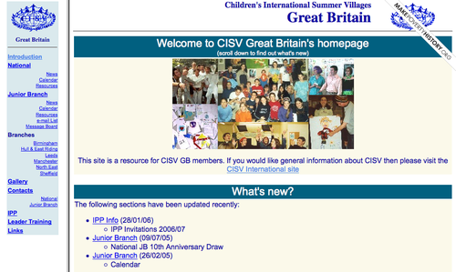
BUT...at least CISV GB's website has a bit of individuality - take a look at these here...
I've been long enough in CISV to remember that a guy called Jonathan from Denmark (who apparently has some resemblance to Ken from Barbie&Ken, at least that is what some Brazilian girls on a bus in Rio de Janeiro claimed in 1999) was the one who managed to make the CISV logo even uglier than it already was by adding a blue bubbley pattern - now isn't it amazing that this logo survived until today?
Maybe it's a consequent move to cover up that ole logo with a bandage in the top-right corner - that is actually a link that leads to another unrelated NGO site...
Good thing ist, that the website shows everybody how much up-to-date it is - the latest news from IPP is from January 2006. But if you're still in doubt, that there are real people in charge of this website, just click on the chapter "Hull and East Riding".
I agree that it's pretty obnoxious to point out all these details, but hey - CISV international provides a design, a content managment system and even individual support - so it shouldn't be to difficult to get a natiional website up to date.
BUT...at least CISV GB's website has a bit of individuality - take a look at these here...
You brought up a really interesting point, something that was really in my mind during the logo-changing period.
If CISV wants us to understand the world is about diversity, why does it takes some steps against it, uniforming everything? I'm definitely not going to get into the logo discussion (all the people around the new one are the same...), but there is some stuff that I just can't understand.
CISV wants to choose what font type, size and color we use. And what's worse, it is a paid font, which obliges us to buy that font. If CISV was to have an "official" font (which I don't think it should), it should be a free one - there are just so many options out there.
Honestly, what is the problem if I use a different font?
Martin Oliveira
CISV São Paulo, Brazil
I totally agree with exchanging the paid font for a free font. In fact, I would suggest somebody should find nice free typefaces and present it at AIM to replace the paid ones.
The issue about uniformation is a more complicated one - More uniformity has pros and cons:
- We now look more professional than before
- Our "brand" is stronger and more easily recognized
but...
- we are losing our "amateur-congeniality"
- we are discouraging volunteer effort by setting strict rules on creativity